What theme are you using?
“What theme are you using?”
A common question from people looking to get a website for their blog, business or organization.
In a way, it makes sense. Most people don’t know coding or the details of how to build a website. But they have heard that themes are what make websites look good. And that you can change the entire appearance of a website by switching themes.
So surely, this is the place to start on the road to a great, new website! To paraphrase the line from Field of Dreams: Find the perfect theme and website visitors will come!
Except maybe not.
In the beginning there were themes
Picking a theme can be very frustrating. Overwhelming.
Because there are gazillions of them out there. And how do you know which one is perfect for the website you want to build?
There was a time when the choice truly was between buying a theme (or finding a free one) or spending lots of time coding the website from scratch.
Theme demos do look cool. Awesome pictures. Great icons and graphics. The right text in the right places.
The first time I installed a theme, I was sorely disappointed. What I just put on my website didn’t look anything like the demo. Didn’t look like much of anything at all.
Because that theme didn’t come with any content or placeholders. Just lots of bare space.
Placeholders and content
If you’re lucky, the theme you select comes with placeholders, so you can at least see what the theme designer had in mind for a given spot on the page.
Now it’s up to you to load in your great content. Which you of course already have.
Probably more like don’t have. Plus you have to create content to fit into the given theme locations. If there are 3 slots for your services, what to do if you only offer 1 or 2?
Hopefully the theme does all you want. If not, there are plugins to extend functionality. Like adding galleries, slideshows or forms. But it gets confusing picking plugins that will work well with a given theme.
That’s why someone came up with “kitchen sink” themes. Everything you could ever need, right in one theme.
The downside is that those themes are much bigger and you’ll probably only use a (small) portion of all the functionality. But the bloated code will slow down the website forever. Making for unhappy visitors.
Visual builders
Feel constricted by themes? Then you’ll love the promise of a visual builder.
Start with a blank canvas. Drag and drop building blocks to create your unique website page. No coding needed.
A number of vendors offer accounts on their platform to build your website. Everything taken care of. No worries. Except, you’re captive to their technology and if they close shop or make a big change, your website may be history. I’ve seen it happen.
There are visual builders for WordPress as well. Called page builders. So you own the website and decide where it’s hosted. And instead of facing the constraints of a theme, you can drag and drop your way to a website.
Sounds pretty perfect. So what’s the problem?
Only that both themes and visual builders put technology first. And skip some important steps.
The cart before the horse
You decide to build a website. So begin by choosing a theme. Or a visual builder. Once you find the one you want to use, you start building.
That’s like going to the lumber yard and getting a truckload of lumber, bricks, and an assortment of windows. Plus some doors. Take it all to the lot and start building your dream house.
Except that’s not how you’d do it. You’d get a blueprint first.
It’s the missing link.
A lot of websites get started. A few pages turn out pretty good. The rest not so much. Or they’re stuck “in construction”. Because, well, not really sure what to put there.
A cool theme that looked awesome on the demo site does not mean much, if you don’t know what content needs to be where on your website to connect with the ideal audience.
Same thing applies in visual builders. There’s no drag and drop that automagically fills them with great content.
A different approach
All of the above is why I don’t start with a theme or visual builder when creating a new website. They come much later in the process.
A better starting place is these 3 questions:
- What does the website need to accomplish?
- Why does it need to accomplish the “what”?
- How does “what” happen?
Those 3 questions apply to the whole website, as well as to each page. When we answer them before creating content and building pages, the result will be a website that is focused. One that does much better at connecting with the intended audience.
Immediately looking for a theme or starting with a visual builder, means skipping right to the “How”.
But to answer the “how”, we need to know the “what” and “why” first.
Going straight to “how” is like jumping down a rabbit hole in Alice’s Wonderland. No idea where or if you’ll come out again.
With technology (“how”) off the table for now, we can focus on what the website must do. And why it must do it. Which leads to content.
Eventually the content will drive the choice of technology.
Not the other way around.
(For more detail about everything to consider at this stage, read Blue-skying your next website.)

From wireframe to design to build
A mind map of everything the website could do or you’d like to see on it is an excellent place to start. The sky’s the limit.
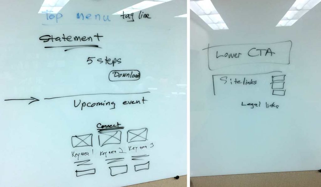
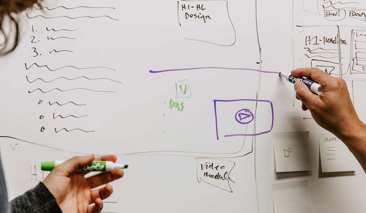
From that we can create a wireframe. This is a very simple sketch showing what content goes where on each page. A white board is perfect for this, especially when there are several people involved in the process. So easy to draw, erase and draw again. Until everything is where you want it to be.
We don’t need lots of detail at this point. It’s enough to know topics. And that text goes here. A picture or video there.
Once the wireframe tells the story well, we’ll build a list of what pieces of content are needed and where they go.
Now we move on to design. Working on things like branding and colors. Fonts and what the website should look like in general. Letting the content and purpose of the website drive what it will look like.
At this point, if you want to use a theme, it’s time to go find one. Which will be a lot easier, because now you have a good idea of what the website will need to do and what to look for in a theme.
If I plan to use a visual builder, then I’ll create design mockups of most, if not all, pages on the website. Because it’s far easier to change a design on paper than it is to redo something on an actual website.
Only now, as design is complete and content has been created (all the text, images and video), does it makes sense to start building the actual website.
Eventually we must deal with how to build that new website. It’s just not a good place to start.
Because how can I choose the best theme when I don’t even really know what the website must do to be effective?
And building pages in a visual builder is real work. Time invested. Which may be all for nothing when I realize that the page is not working.
Sketches on a whiteboard or paper are, on the other hand, quick and easy and help us formulate our thoughts. Sharpen them. Figure out what we’re really trying to say.
It’s work that saves time (and headaches) in the long run. And we can all use that. Plus, when we create content first and build second, the end result is a much better website.
Never miss out!
Get an email update every time I publish new content. Be the first to know!

