WordPress reimagined
Once upon a time there was a blogging platform called WordPress. A nifty little tool that you could install on your own server and presto have a blog. Posting new content was easy. So was organizing it in many different ways. Plus searching for it. What joy!
Those were the internet days when most websites were all hardcoded. Real websites for businesses and nonprofits, that is. Content and the code that defined the website all mixed in together. Making even a small change involved calling the developer.
Therefore, those websites didn’t get updated very often. It was not unusual for a website to be built, deployed for the world to see and never touched again for a long (far too long) time.
Into this state of the world came WordPress. It was built around a database. Content and website code were separated. Content could be updated without touching the code. By the website owner.
The web made simple!
If you wanted to add new content, you just logged in and created a new post. An editor appeared that presented 2 options: Visual and text.
Text view
Actually, text view was a bit of a misnomer. You actually saw both the content text and the formatting code that made the text pretty. So it got cluttered pretty quick. But it was the best way to make a post do exactly what you wanted it to do — as long as you knew some coding.
Visual view
The visual view was an attempt at creating an environment where what-you-see-is-what-you-get. Except it was a bit clunky and didn’t work as intended all the time.
When I started using WordPress around 2010, it was still primarily used for blogging. But I was building websites where blogs were just a part of the overall website. I didn’t look at it that way, but I was pioneering a trend.
Today, WordPress powers something like 25% of all websites and the vast majority of them are not primarily blogging websites. WordPress is the engine behind business, nonprofit and educational websites — large, medium and small.
The one sore point on this platform that has matured and grown in power has now long been the post and content editor. Because it hasn’t changed for many years. Still a choice between doing it all text style, with content and code mixed, or using a visual editor that invites confusion and offers limited options for text formatting (or install some plugin to fix that shortcoming).
Until recently.
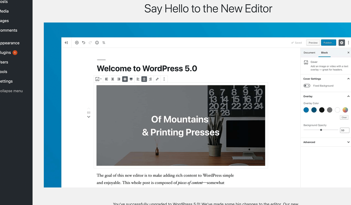
At the end of 2018, WordPress 5 was released. A major upgrade that brought us a new content editor, known as Gutenberg.
Enter Gutenberg
Gutenberg brings a new vision of content editing, based on blocks. A text paragraph is a block. A heading is a block. An image is a block. And so on. Rich layouts can be formed by combining several different blocks and saved as templates. Blocks can be rearranged and have pre-assigned styling.
Creating a new post has become a lot easier and more intuitive. Add a block. Enter some content. Define what type of block it is. Maybe apply some formatting inside it. The editing layout gets close to the actual page.
It used to take me at least half hour to post a new article on my blog. I’d drop in the already written and edited blog content into a new post in WordPress. That was the fast part. Adding the pictures was also quick enough. The slow part was proofing and formatting the text to make it look like I wanted. That part involved editing on the backend and frequent previewing on the front end.
With the new editor, I work in a what-you-see-is-what-you-get environment. Adding blocks is quick. Drop in text dropped in. And a couple images. Add formatting if needed. Since it all looks so much like the final thing, I do proofreading on the backend. The process is much faster.
So what’s not to like?! Besides, this is the first iteration and things are going to get even better from here.
To upgrade or not to upgrade
There is just one little caveat: The reason I’ve updated all websites I manage to WordPress 5 and then promptly disabled the new editor. Pending some updates to the themes of the websites.
Because the new editor includes new formatting options, as a result of all the new blocks. Especially for images. For instance, allowing them to easily expand beyond the text column width. Even to go across the full width of the viewport (window).
So an existing theme needs to be updated to properly render some of the new blocks.
If the website was built in the last couple of years, the best course is likely to update the theme to properly support all the new features in WordPress 5 and Gutenberg.
If the website is older, then so many other things have changed when it comes to best practices for website development that a redesign may be the best path forward. Get the full picture with a website review.
Certainly any brand new website going online must now be designed with full support for WordPress 5 and Gutenberg.
You may ask why I updated the websites and turned off the new editor instead of just leaving them in the previous version of WordPress (4.9)?
Simple: WordPress 5 is much more than a new content editor. It also includes all the latest security updates. And I don’t want to go without those. Because security.
One beauty of WordPress is that its core is continuously being updated. I have a website I built in 2010. It’s not responsive (sorry all mobile users). It was state of the art when I built it. But that was an eternity ago in internet years. It needs a total rebuild into today’s technology. But even with an ancient theme on it, I’ve been able to keep the WordPress core updated and it’s running WordPress 5 (with the new editor turned off). So it stays operational and secure.
Clearly there are other platforms for building a website besides WordPress. That said, this is the little tool that could and still can. I can’t wait to see where it will go, now that it has a modern editor that is easy to use.
I was talking with a client the other day about how to get their website up to taking full advantage of the newest capabilities. Did a very quick demonstration of the new editor. Both the client and his associate were immediately impressed. The choice to update their website to take full advantage of the new editor and its capabilities became a no-brainer. Just with that short demo.
Once you use the new editor, you’ll wonder how you ever got along with the old one. Posting might become fun again.
Welcome to WordPress 5 and Gutenberg. The future looks great.
Never miss out!
Get an email update every time I publish new content. Be the first to know!

