When a good launch goes bad
This really happened. I watched it play out in real time.
One of my hobbies is model trains. You should know that model railroaders eagerly await new product announcements each year. Will this be the year the model I’ve been wanting for a long time will finally be released?
You should also know that the announcements are just that. The actual models won’t be in stores right away. Could be months or even a years. Production runs are often limited run, in which case, to get a particular model, preordering is essential.
New products from manufacturers were historically unveiled at the International Toy Fair in Nuremberg, Germany, in early February each year. Then the general public would find out about all those new products once store owners came home and passed out catalogs in their stores.
Of course the internet changed things. Digital flyers and catalogs started appearing online. First right after the fair. Then some before the fair.
When Covid hit, the Toy Fair had to be cancelled for a few years. Now all the new product announcements happened online. No problem there. We got used to it. Actually meant that consumers like me found out earlier than in the past.
This season the first announcement came during the last days of the old year. Because nothing like being first out of the gate.
Then others followed every week or few days.
But one company didn’t even give a hint as to when they’d release their info. Rumors flew.
Then the word on the street was that the company, Brawa, would release their new products flyer on January 27. Some folks waited by their computers until well past the stroke of midnight. Nothing. he
Morning came. Nothing.
Lunch time came. Still nothing.
The Announcement, finally, I think
By early afternoon, someone posted on a discussion forum that Brawa now announced new products on their home page. I happened to see the notice and visited the home page. Sure enough. Big banner. “New for 2023”. I clicked the banner. Nothing. I opened a development tool and looked at the source code. The banner wasn’t linked to anything. It was just a big picture.
Disappointing.
Someone posted in the forum that while there was no pdf flyer to download yet, all the new items (400+) were in the online product gallery, among all the regular products.
Great. That will be a lot like looking for a needle in a haystack.
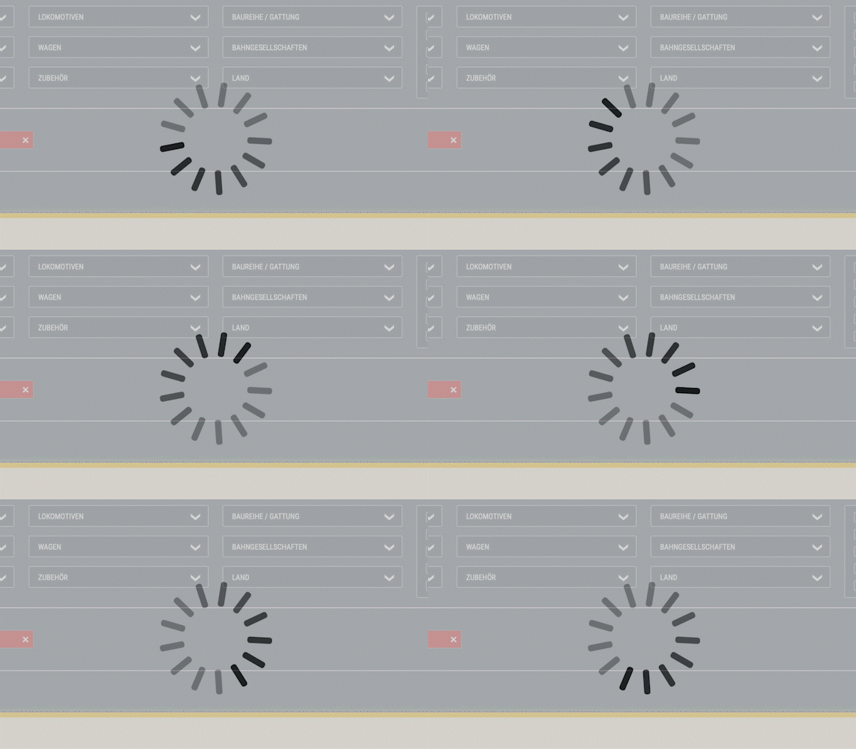
Problem. Brawa’s website has a big selection grid to help you narrow down just which products you’re looking for out of their full offering. On regular days that selector is rather slow. You have to really want to check out their products. Unless you just like watching the spinning wheel.
That’s on a good day. Now imagine what happens on a day when a lot of fans come to the website to look for those eagerly awaited new announcements. Higher traffic than normal. Everyone encountered the spinning wheel. Not just for a long time as usual. But without end. You could go for a coffee and make it back before it was done. That slow.
Meanwhile, on the home page, that banner was still not clickable for a few more hours.
Then finally clicking worked. Clicking opened a long page proudly introducing all the new products and, yes, with a link to download the long-awaited pdf.
Could it have been done better?
Was this a good user experience? Definitely not.
Will Brawa go out of business over this? Not today. If the problems today are an indication of poor planning and execution of this particular announcement and the next time will be better, then they’ll survive. Today will be a blip on their radarscreen.
Besides, this was an announcement. No actual product sold on their website. You come there to look at their offerings and then buy from your favorite online or brick-and-mortar retailer.
What if this had been a case of actual sales not happening? As in people expecting to be able to pay money and not being able to? Then definitely lost sales and customers. Who very well might not ever come back.
There has to be a better way.
5 steps to a smooth announcement or launch
This experience brought up several lessons that we as website owners can learn and apply when we announce new products or services on our websites.
#1 Get the key info to visitors without overwhelming your web server
Visitors want the announcement fast. In Brawa’s case that meant being able to download the 92 page flyer. Fortunately, that can be done without overwhelming your web server.
A landing page with the download link right there cuts down on how long visitors have to remain on your website. On launch day, make the home page be a landing page. Let people come, click the link and get the flyer. Brawa did that eventually. Would have saved so much hassle if the banner was clickable from the first moment it went live.
Then have the flyer itself hosted on a service like Amazon S3, Dropbox or Google Drive. Those are built to handle multiple connections and serve file downloads. Plus your server’s precious bandwidth won’t be used up by all the downloads.
At the time of announcement, almost no one cares whether the new products are actually in the big product gallery. I’ve seen companies point out that their new products will be added in the regular online catalog later. That discourages visitors from hitting your product pages looking for the new stuff at a time of higher than normal traffic.
I know, any other day I’d say you want people to stay on your website and engage with it. Because that’s going to make them more likely to become customers. But if everyone stays on the site longer and it slows down to a crawl, that’s a bad experience. Instead, when visitors can quickly get what they wanted, they’re happy and actually more likely to come back (and eventually buy).
#2 Work on timing
We all like to work regular office hours. But consider making that download available during the night. Think somewhere 3-4am when even the diehard fans have gone to sleep.
Because if you release during the day, and people are at their computers waiting for the magic moment, your website will get a lot of traffic from hopefuls who just keep refreshing the home page, waiting for the announcement to appear. (Which may make your visit count tick upwards, but those are not useful visits.)
After all, we’re not selling tickets to a Taylor Swift concert. There’s nothing lost by the announcement being on the website when people get up and first check their computers in the morning. Which will be more spread out than mid-day or early afternoon when everyone can be sitting their waiting.
#3 Do things in the right order
I already talked about making the pdf flyer available first. And that adding the new products to the product gallery can happen later, like the next day, when the initial fury has settled down.
But even with a pdf there’s a definite order to follow: Start at the end.
We want visitors to be able to download a pdf.
Step 1: Upload the pdf to Amazon S3, Dropbox or Google Drive. Test that the link actually works.
Step 2: Build and test the landing page that introduces the new products and that has the button linking to the pdf. When everything tests properly, take the page live. Since it’s not in your navigation, people won’t find it (unless they can guess the URL). Eventually Google will find it and then your secret is definitely out, so don’t take the page live days before you want people to find it.
Step 3: Create the banner for your home page and make sure clicking it links to the landing page. Publish the banner.
That’s it. The news is live. In a controlled manner. Up until that banner on the home page went live, visitors to the website wouldn’t see anything new or different.
Because visitors who want your new product flyer only have to (briefly) visit 2 pages on your site, the load on your web server is minimized. A mass of fans hitting the site at one time can and will still crash it, but that’s far less likely this way than if they have to spend time digging through your regular product catalog to fine the new goodies.
Plus the bandwidth for actually downloading the flyer comes from the service where you hosted it, which is not your server.
#4 Automate so you can sleep
Plan ahead and you might be able to get a full or mostly full night’s sleep even while your new product flyer launches to the world.
Uploading the pdf can happen a day or two before the actual event. Just keep the download link secret.
The landing page can be built ahead of time and either scheduled to publish during the night (easy if you use WordPress) or taken live the day before the event. Because unless someone has the URL for it, they won’t find it. It’s not in the navigation on your website.
The banner on the home page can also be scheduled to display at a desired time. Or set up ahead of time and all you have to do hands-on at the magic hour is to take it live manually.
#5 One more thing
Test. And then test again. Whether there’s one step in the chain or multiple, test them all. Repeatedly. So that you know it all works. Because the last thing you want to do is make a public announcement only to find that this or that link in the chain doesn’t work.
Want to keep the fans happy.
If I had 6 hours to chop down a tree
“Give me six hours to chop down a tree and I will spend the first four sharpening the axe.”
Abraham Lincoln
Turns out the words of Abraham Lincoln apply to web launches and announcements too. Because it’s all about planning. With the end in mind.
Key question: What is the ultimate outcome?
Then working backwards from that event, we can determine the steps involved and create them one at a time. Since we’re working backward, there’s no risk that website visitors will prematurely discover what we’re about to announce. And we also ensure that once we do let the cat out of the bag, website visitors can easily find what they (and we) want them to find.
Happiness all around.
Never miss out!
Get an email update every time I publish new content. Be the first to know!

